
Visual aids are a tried and true way to help students remember key content. According to dual coding theory, learners are more likely to retain information if it’s presented both verbally and visually. Plus, it’s just more interesting than looking at text-filled slides, or an instructor’s face for an entire lecture.
Visual content can also enrich the learning experience for students as they produce their own presentations, reports, and videos.
But adding visuals to presentations and documents, and encouraging your student to do the same, can — often unintentionally — lead to re-enforcing stereotypes, or worse. Some students might feel literally left out of the picture. However, it can also present an opportunity to broaden visual representation.
Below is a list of some of my favourite resources that provide a diverse collection of visual content for free, as well as some tools to ensure students with visual impairments can benefit from the visuals you employ. .

The Noun Project: More than icons
The Noun Project is best known as a library of icons created by a community of designers. I probably add an icon from the site to something I’m working on every day.
But Noun also has a broader mission to, as stated on their About Us page, build “a global visual language…that allows quick and easy communication no matter who you are or where you are.”
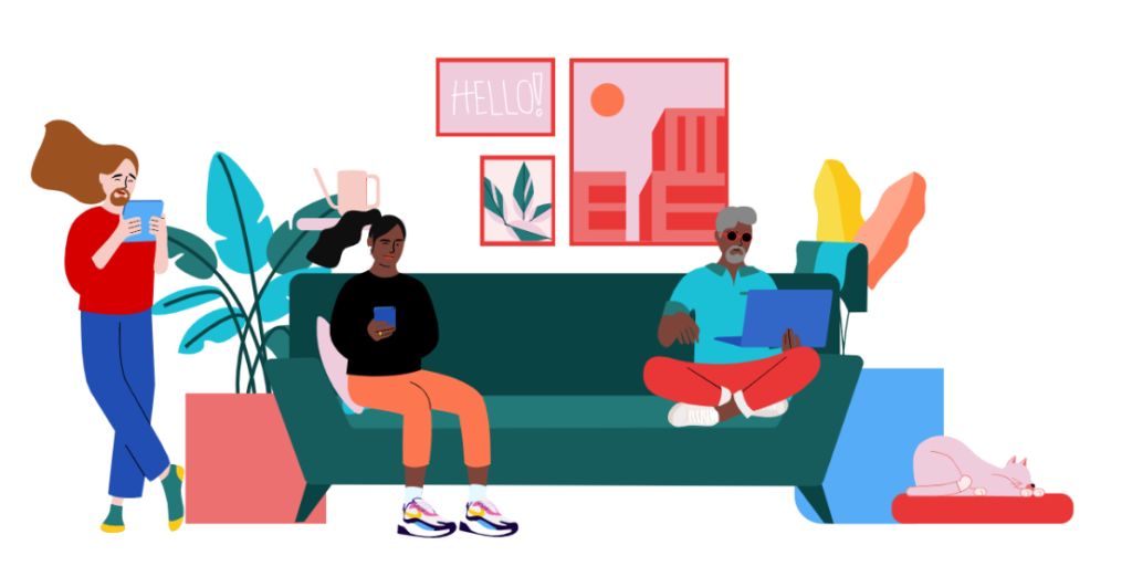
In addition to its extensive icon library, the site launched Noun Project Photos in September 2020. This stock photo resource is curated with a focus on celebrating diversity and inclusion, something often lacking in other stock photo sites. Photos feature people of various races, genders, ages, abilities and body types. The collection contains over 10, 000 photographs and continues to grow. Photo metadata tags range from “fun,” “pizza,” and “friends,” to “multi-ethic group,” “biboc,” and ” lgbtquia.” Mostly, the collection offers photos of people from diverse communities in everyday situations, which provides us an opportunity to broaden the definition of normal.

Web-quality photos can be downloaded for free. Higher res versions are available in a pay-per-download option. Web-quality photos come with a small watermark that attributes Noun and the photographer. Licensing varies by photograph, so be sure to check out the license info link before use.
Another initiative is its Iconathons. In these interactive workshops, contributors design icon sets based on a theme related to inclusivity. For example, the Iconathon in October 2019 focused on developing icons that go beyond stereotypical representations of women.
Blush.design: art and inclusivity
If you are looking to add some trendy illustrations to your presentations, Blush is a great choice.
Blush currently contains 35 collections of doodles. Doodles are customizable illustrations, many of which include people with options for skin colour, hair (head and facial), eyewear, dress, and props. Many collections have avatar and single-person versions, as well as scenes. It also has a randomize option that will create near infinite combinations. There are free and paid tiers, with paid subscribers having access to more scenes customizations, and larger file downloads.
As co-founder and CEO Pablo Stanley told the folks at the sketch.com blog (Sketch is a design platform that has a partnership with Blush), “The illustrators who’ve created collections have made sure to include people with different backgrounds, abilities, and beliefs in their illustrations. So people can tell their stories with doodles that represent them or their audience.”
Pixton: comics for all
Pixton has been a popular choice in K-12 classes for some time. With a classroom account, teachers can create an online classroom space with each student designing their own avatar. The avatars can then be used to create comic strips for assignments and other activities.
Recently, Pixton made the news in Canada. A Sikh student from Newmarket, Ontario and his teacher reached out to the company to point out the platform didn’t include a traditional Sikh head covering. The company asked the student to provide some reference photos and the design team promptly added the option.
While you need an account to take full advantage of the collaborative features of the program, it can still be a useful tool at the free level. Students can create and download avatars, and they can also design simple comics with limited options. A quick tip – you can redesign your own avatar as many times as you like, changing gender, skin colour, features, clothes, pose, and expression. By doing so, you can download multiple characters for use outside the platform.
And an honourable mention to Bitmoji, another customizable avatar creator that is also a meme generator. Bitmoji offers a free app and a Chrome plugin so memes using your avatar can be easily shared with others. The app also contains multiple options of customization including many traditional head coverings.
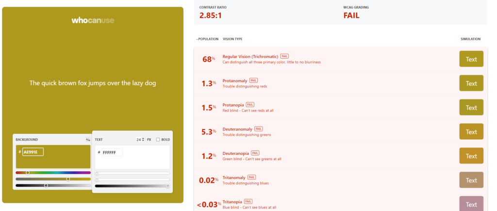
Making better colour choices with whocanuse.com
I recently asked my students in a design course what colours they liked. It turns out pastels are very popular right now.
Pastel text on a white background might be calming and trendy. But, it’s not accessible for those with visual impairments, or for anyone in a bright light environment.
You can ensure the colours you are using meet accessibility standards using the web tool whocanuse. You can paste in the hex colour codes for the colours you wish to use, or take advantage of the colour sliders to pick colours within the tool. The results will depend on the size and weight of the text as well as the colour combination. Ideally, all your colours will have a AAA WCAG grade, but AA is sufficient in most cases. If your colour combination fails, you can adjust the sliders until to have a successful result.
A reminder that ensuring colour contrast is only part of the picture. You can check to see if a colourful palette is colour blind safe using Adobe’s colour tool. Also, make sure to include alt text for all visuals so those who use screen readers have written descriptions. Here’s how to add alt text in Google Docs and Slides, Microsoft Word and PowerPoint. In D2L Brightspace, you will be prompted to add alt text when you add a new image.
For more information about online accessibility and tools available at Toronto Metropolitan University, check out www.torontomu.ca/accessibility/.
Even more resources for creating inclusive content
It’s now 2023, and I am finding more and more curated lists of inclusive content options. As I come across them, I will add them below.
Diversify your visuals – Jeremy Caplan
List of image galleries to promote accurate and equitable representation
Sally Goldberg Powell is the Learning Resources and Technologies Specialist with the Digital Learning team at the Centre for Excellence in Learning and Teaching at Toronto Metropolitan University. She also teaches two first-year courses at Toronto Metropolitan School of Journalism and is the recipient of the 2025 Dean’s Teaching Award.

For more tips, check out the Tech for Teaching page.